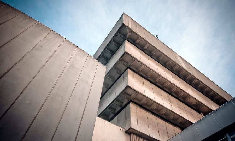
Brutalism has proven that websites and applications can be nightmares of unordered images with superseding clashing fonts and colors directly out of the paranormal. Embedded CSS, code without tabs, and unstyled HTML tables are working and it’s achieving just what it has always wanted. It’s weird but it’s totally agreed that it works.

We’ve all handwritten our code, tweaked out the bugs, polished the front-end, and reviewed our back-end. But yet it has never been perfect. What we cannot do it, do all this and yet call our trends brutal. Honestly, if this was easy, everyone would be doing it. There comes a new kind of learning with Brutalism that has completely changed the dynamics of what we have always known. Learning these new trends is not easy and let’s face it, there is no way to get this right. What brutalism tries to achieve is complete incompleteness that needs to look like an amateur with pro skills built this out. If you’re going to try Brutalism, be prepared that some really top-notch designers are going to call your website ugly.
If you can look beyond the madness and willing to take the plunge with this inconsistent disassembly of non-concurrent grids, then be ready to think big, bold, and forget about the safe colors that you’ve always known. It will have large amounts of blank space that you’re going to fill with more clutter. Sounds disgusting right? Go for it. If you think you hate the design you’re building, then you’re on the right track.
Looking for inspiration? Take a closer look at the way developers and interior decorators are approaching their architectural plans. They’re vivid, somewhat clean, and yet super abstract in the most brutal possible way. Now imagine taking that 3D space and flattening it down onto a website.
If you think that you can relate Brutalism to something you’re aware of, or something you can concur with, then you’re not thinking right. Your design sense for this trend needs to come out of the ordinary. Let’s put it this way, arguing about the structure of your hamburger menu will be the least of your worries. Do not be afraid to explore unchartered territories. Use color combos that you’ve always died to try out. Play with vivid colors and forget about the hues and gradients. Let your images be incomplete and distorted. Place links that are hard to find and avoid letting the user navigate your site easily.
Before you embark on your journey of the unknown, remember that Brutalism isn’t for everyone. Your objective here is to not dissuade your existing or potential customers but instead offer a sense of radical change you or your business may want to portray. I don’t see how established web properties can get away with this, but if Bloomberg can, then there’s hope for you.


