

Website and app experiences are becoming far more sophisticated than ever before. It’s definitely not the same as how it used to be. So, if you’ve been thinking that your classic marketing strategy is going to work wonders for your business, I encourage you to think again. It’s time you let go of the past and start thinking about the future by designing for user experience. If you implement even one or two of these experience hacks, you and your business are going to see better conversations rates that lead to better sales.
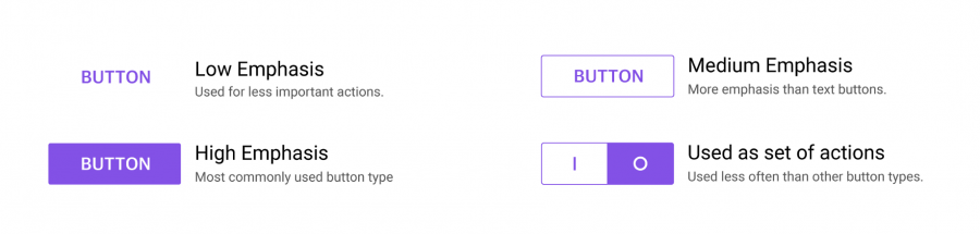
Build User-Friendly Buttons and CTAs

Let’s talk about buttons for a minute. A lot of designers say buttons need to look good and that’s all they care about. You need to take this a step further. Buttons are defined as actionable elements. They are critical to the user’s journey and they are far more critical to accomplishing a goal.
Curved Borders
Take some time out to make sure that the buttons on your app or site have a friendlier aesthetic to them. Beyond just colors, curved borders are psychologically pleasing. They offer a sense of zen and help brands invoke trust in their users. Use a border-radius to create friendlier buttons. Avoid using capsule designs. Capsules are often used for highlighting text these days. When you’re designing for user experience, make sure you’re using buttons and capsules for different


Designing for User Experience with Fonts
The font that you use inside your buttons needs to be legible, while at the same time should look like they belong to your website’s font family. Instead of using a different font type, simply begin designing for user experience by using a different font-weight.

CTA Storytelling
The CTA in your buttons should tell an actionable story. Using a call to action such as “Pay Securely” instead of “Pay Now” allows the user to not only trust you but also creates a sense of calm instead of creating demand. Similarly, if you are offering a service, a CTA that says “View Your Dashboard” can be written as “View My Dashboard”. Try different ways to personalize the experience for your users.

Another mistake people do when they write CTAs is that they define an action. I see a lot of buttons that say “Download Now” or “Submit Now”. Changing this to “Get your Free Book” or “Request a Quote” can really impact the way your users experience your website. Start designing for user experience today with these super easy copy changes.
Encourage User Accomplishment
Growing your business demands that you optimize your brand’s communication. It’s not as difficult as you think it is. All those stories you hear about people saying “brands should tell stories” are true. The difference today is that your user wants to be a part of your story.
User Personas
Involve your user’s persona everywhere you can. You can build a user persona by interviewing potential customers. Create a standard profile of them. There’s a great guide to creating user personas you can check out. Once you understand the mindset of your target audience, write content on your site that relates to them.
User Empathy
Product pages need to have easily readable content pieces that talk about the story you need to convey. If you want to try something more interactive, build reels on Instagram. Customers love to relate to the brand they are investing in. In the image below look at how Evernote describes the purpose of their business. That last line, “…falls through the cracks.” is a perfectly relatable piece of content.

Trust and Security
Another great trick I highly recommend is to show users that your brand is highly trusted. Having an SSL certificate alone is not enough. Your customers expect that from their browser and will never credit your brand for it. It’s highly unlikely they will notice it either. Being able to visually represent trust on your website or app is absolutely essential and this can be done by displaying a seal of trust on your essential pages.
Showing a seal-of-trust such as a Norton or TRUSTe logo creates a representation of trust and a security acknowledgment. Put it on your site’s footer or on the checkout page where you want to boost conversions. The graph below shows which badges users relate to as a sense of trust when they are shopping online.
Offer Virtual Assistance
AI & Non-AI Chatbots
I do not want you to think that this is about AI. Let’s no go down that road. Instead, let’s simplify things a bit. Just like at an offline retailer, your online users need assistance when they want to make a purchase. Place a non-intrusive button somewhere relevant on the product page that opens up a programmable chatbot. The bot can be pre-programmed to answer potential questions the user may have about the product. Think of it as an FAQ that comes up as a small blurb on the screen. You may need to take some effort to optimize the content here but trust me, it’s totally worth it.
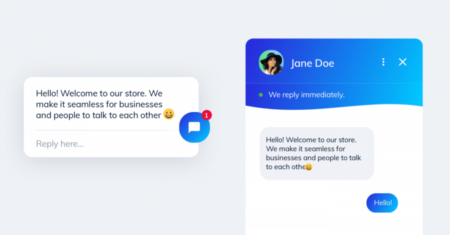
If you have the skill to integrate AI bots, please do so. Otherwise, even a link that opens up a Whatsapp chat to connect the customer with you works equally great. Just remember to capture the intention of the user when they initiate the chat. This way you can start designing for user experience and know what product they need assistance with.
Use Non-Intrusive Popups
This may seem a little weird to some marketeers but as cliched as it may sound, popups work. The real challenge is knowing how to use them.
Historically, popups have always been categorized as these intrusive distractions that people want to dismiss immediately. It’s true. Nobody likes a popup that distracts them from what they are trying to do. Imagine if you are reading this article and deep into understanding it, then suddenly a popup comes along and distracts you. Or imagine, you’ve reached the checkout screen of an eCommerce website and out of nowhere, some random lead generation form comes up as a popup. Terrible right?
Exit Intent
The key is to be able to use popups at the right time and at the right place. One of the most popular strategies is to show a popup when a user expresses interest to leave your site. This is known as exit intent. Exit intents should definitely be used. They are a great way to retain the user’s attention before he leaves. You can use copy such as “Before you go, here’s an offer where you may like” or “Share with us your email and we’ll let you know when our Black Friday Sale begins”. You can capture their intention in creative ways. Pair the copy with sharp graphics and friendly curves you got yourself a winning strategy.

Remarketing Notifications
Another great way to use pop-ups is by offering returning users a personalized message. Imagine if you wanted to buy a t-shirt online and the product you saw last time was a black one. I can use re-marketing code to show you a popup letting you know I have other colors available. The copy could read as “Need this in Blue instead of Black?” Personalization is the key.

Hello Bars & Sticky Footers
Another way to use a popup is by using it as a sticky footer or hello bar. Highlight the sale pitch of the product with a CTA allowing users to click on it regardless of where they are on the page. More CTAs the user can see, the more likely he will want to proceed to checkout. You can try A/B testing copy on the CTA at different parts of the page to see which one performs better.
Make Navigation & Search Easy
Depending on the type of business you are in, your customers need to be able to navigate through your site easily. This can be tricky if you have a lot of products and services on offer. Make sure that you group your products and services in the correct category. There is nothing more frustrating than trying to find something that is supposed to belong to one category but is placed in another.

Breadcrumbs
eCommerce websites have a certain standard navigational flow. Their pages include home to a category, to a product, to cart, and then to checkout. Using breadcrumbs wherever possible is a nice way to let users understand they are not lost. When designing breadcrumbs, please keep in mind the difference between your location-based categories and attribution-based products.

Designing for User Experience with Search
If you have a lot of products on offer, then expect your customers to use your website’s search function to find what they want. When users perform a search on your site, you will want to show them imagery wherever possible that reflects what they want to see.
Navigation is something that needs to be done 100% accurately. If you need help, reach out to me on Twitter or consider hiring a PM that has the right Skills for Product Management.
Make Checkout Great Again
If you’re running an online store, you should know that the checkout flow is what makes or breaks your user’s payment journey. There are a lot of nitty-gritties to pay attention to, so we’re going to try to cover them a little more briefly.
Subtle Animations
The first thing you need to try to do is making your checkout experience as interactive as possible. Things like subtle animations on buttons when they are clicked tell the user that they are on the right path. Progressive accomplishment on your checkout page should be your objective. Something as simple as an animated checkbox can really work wonders.


Savings & Discounts
Another great way to engage users at checkout is to show a savings blurb. There’s nothing more satisfying than letting your users know that they are getting this product at a discounted value. You do not have to offer coupons. Simply offer the product at a discounted rate and show the saving value that the user is getting.

Non-Disruptive Flows
When users reach the checkout page, they have a very high intention to complete their payment. You do not want to distract them at this point in time. Ensure you do not have any popups on this screen. Also, remove any links that can take the user away from the payment process.

No Hidden Fees
One of the best ways to ensure you can bring in that conversion is by trying to show the pricing on their cart without any hidden fees. If you can show your pricing that includes tax, that’s great. If not, make sure that they know what they are paying for. Customers hate hidden fees. Do not offer surge pricing or differential shipping pricing. It’s a total turn-off.
Multiple Payment Options
Always have more than 2 payment options on the checkout screen. You want to ensure that you are able to cater to customers that are comfortable with their preferred payment type. This is where that earlier learning about user personas will help you decide which options to offer. Imagine if I love to pay using UPI. Then I want to buy something from your website that offers me only PayPal as an option! I’d just lose interest in completing that payment. You’ve lost that sale. So make sure you know what options your customers need.
Designing for User Experience Resources
Designing for user experience is super critical when it comes to generating sales. It’s a tremendously competitive market out there. It does not matter if you have secured a niche too. All it takes is for someone else to come along and steal business from you. Stay ahead of the game and ensure that you use some UX and UI principles to Improve User Experience. If you’d like to learn more, check out these UX Tools to get started.


