

Developing a website is an unavoidable aspect of establishing an online presence, but very rarely do businesses talk about how to improve user experience for their websites. Websites are beneficial to companies because they provide convenient access to all of the company’s information and services. However, simply designing a website is insufficient; offering a superior user experience to visitors is far more critical. To improve their overall browsing experience, visitors must be provided with a special User Experience (UX). Here are some useful UX tips and web design fundamentals to keep in mind in.

1. It’s all About Responsiveness

Smartphones are driving a lot of traffic to a lot of websites, so you need to make sure yours is responsive too. Going mobile-friendly is now a convenient way for website owners to satisfy the browsing needs of mobile internet users and ensure greater exposure. Additionally, remember to prioritize quality over quantity when incorporating any sensitive functions. It will provide consumers with an exceptional experience. As a result, never skimp on this website UX design trend. A variety of responsive design testing tools are available to assist in the evaluation of website responsiveness. Try BrowserStack to help you see what your website looks like on different devices.

2. Page Speed is Critical to Improve User Experience

When it comes to web design and providing an excellent user experience to customers, page loading time is extremely important. If your website takes too long to load, it will frustrate your visitors and, as a result, reduce conversions. The time it takes for a page to load is also important in determining whether or not a user can return to the web. If your page speed is slow, in terms of user experience, for the first time, there’s a good chance they’ll forget about your site in the future.
If you’re using WordPress, there are a number of guides available to help you speed up your blog. What you might not realize is that the web hosting server plays a significant role in speed. If you’re looking for a cheap and stable host, Bluehost or Hostgator could be a good choice. There have recently been some very positive things said about Hostinger too, which could be another choice for you.

3. Keep a Tab on Security
Your users can develop confidence in you if they are confident in the security of their payment information stored on your website. You can easily provide users with an outstanding browsing experience if your site security is solid. As a result, a security seal can attract a lot more customers to your business. More customers would also aid to increase conversions. More information on WordPress security can be found with the help of the hundreds of pre-existing plugins.

4. Use Bullet Points
Bullet points enable consumers to quickly learn about the main features of the products and services that your company offers. As a result, taking into account this specific website design pattern will aid in user engagement. You can get imaginative with the bullet points and provide a variety of images to help the readers understand what has been defined in the bullets. This will improve the aesthetics of your website. Using bullets is also advantageous because it allows designers to separate key points, making it easier for users to comprehend. By simply using bullet points, a lot of sites increase their conversion by nearly 20%. If you’re trying to find ways to do more, you can check out my post on boosting Visitor Engagement in Digital Marketing.
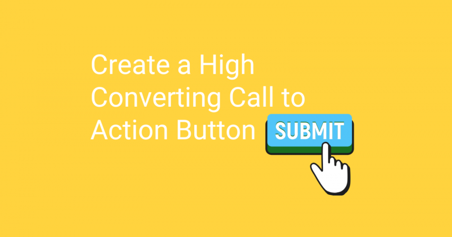
5. Create Call to Actions
Your website’s CTA (Call To Action) should be visible on every page. It will help in achieving a higher conversion rate while still providing a special user experience. Another important consideration is to position your Call To Action button above the first fold so that users can quickly see it and react if they want to. Giving your visitors a simple way to find and respond to CTAs is one way to increase conversions. As a result, make room for this website UX design trend. With only a simple CTA, eCommerce sites are able to increase their email opt-in rate by 27%.

6. Use the Right Color Palette
When it comes to creating buttons, text items, links as well as selecting the tone of your website, colour is essential. You must also consider the psychology of the colour you chose. It has been shown that the use of calming colours increases conversions. Since different colours convey different messages, consider the message you want to send to your users when selecting a colour for your website.

7. Improve User Experience with Animations
Incorporating motion and animations has its own set of benefits. Using these elements in titles and paragraphs, is a no-no. The subtle animation on icons and images, on the other hand, will aid in drawing users to a call to action. If you want to showcase different views on your website, using an animation is a good option. To get your clients’ attention, try using very subtle animations. It is true that animated vectors take precedence over content, and this is also true of website design trends.

8. Get Creative with Images
Images are strong visual statements, but they won’t help you unless they’ve been well-designed and optimised. When using pictures, try to choose those with the highest resolution. Check to see if they create a connection between your website and your audience. Just remember, stock photos aren’t as effective as actual ones. On the one hand, while photos contribute to the overall aesthetics of your website, they also help to keep visitors on the site and improve their overall user experience.

9. Use Videos to Explain Complexities
Although photos are vital for engaging clients on your website, videos will hold their attention for a longer period of time. People have a higher regard for items that seem more plausible, and videos can play an important role in this regard. For example, if your website is promoting the launch of a new product, presenting all of the features solely through content would be difficult. Videos, on the other hand, can help people understand a product’s features quickly.

10. Fix 404 Errors to Improve User Experience
I can guarantee you that your customers would not appreciate seeing a 404 error for their search on your site. Resolving these no content found errors is a step toward providing a better user experience to your customers. Users normally expect their queries to land on a particular page when they search, and if they find any such missing content, they will, of course, punish you by leaving your website immediately. As a result, make certain that this particular website UX fundamental has been properly implemented.

11. Use the Right Amount of White Space
White space lets users concentrate on other aspects of the website while also making the content more relevant. This significant space is also referred to as the website’s breathing space, as it allows other elements to pop up incredibly well on your site. If you intend to provide a lot of details above the fold, it’s a good idea to leave a lot of white space on your website. Remember, you can also make errors when using white space on your website; therefore, it is advised that you strike a balance between the duration of your content and the amount of white space you plan to use.

12. Catchy Headlines Really Work
Headlines must provide an emotional bond with the audience. It must be material that your consumers want to see. Remember to use keywords in your headlines so that your message can be targeted to the right audience. Keywords are important not only for attracting potential customers but also for helping websites perform well in search engines. Since search engines offer more weight to headlines, having keywords in them will help your website rank higher. As a result, selecting the correct headline and presenting it extremely well could also aid in a higher conversion rate.
Improve User Experience with Consistency
Creating a cohesive website entails aligning it in such a way that it appears to be properly structured for your audience. Everything on the website, from the headline to the design elements to the font option to the button style and colouring, should be themed to improve the overall appearance. This will enhance the user’s navigation experience and make it even more amazing. Consistency is important because it allows your users to seamlessly transition from one feature to the next.
I keep sharing new ways to improve user experience on my social channels. Follow me on Twitter to learn more or find me on LinkedIn to get in touch with me to help you build your next great website.


